I have always loved acrylic painting.
I had taken a long break from painting and art in general, but in the past year had been inspired to create art again. There have been other mediums I have explored, such as graphite sketching, coloured pen and pencil, and watercolour, but none I have enjoyed as much as acrylic painting.
There are some things I have learned along the way, and I hope to share and impart some of that knowledge here.
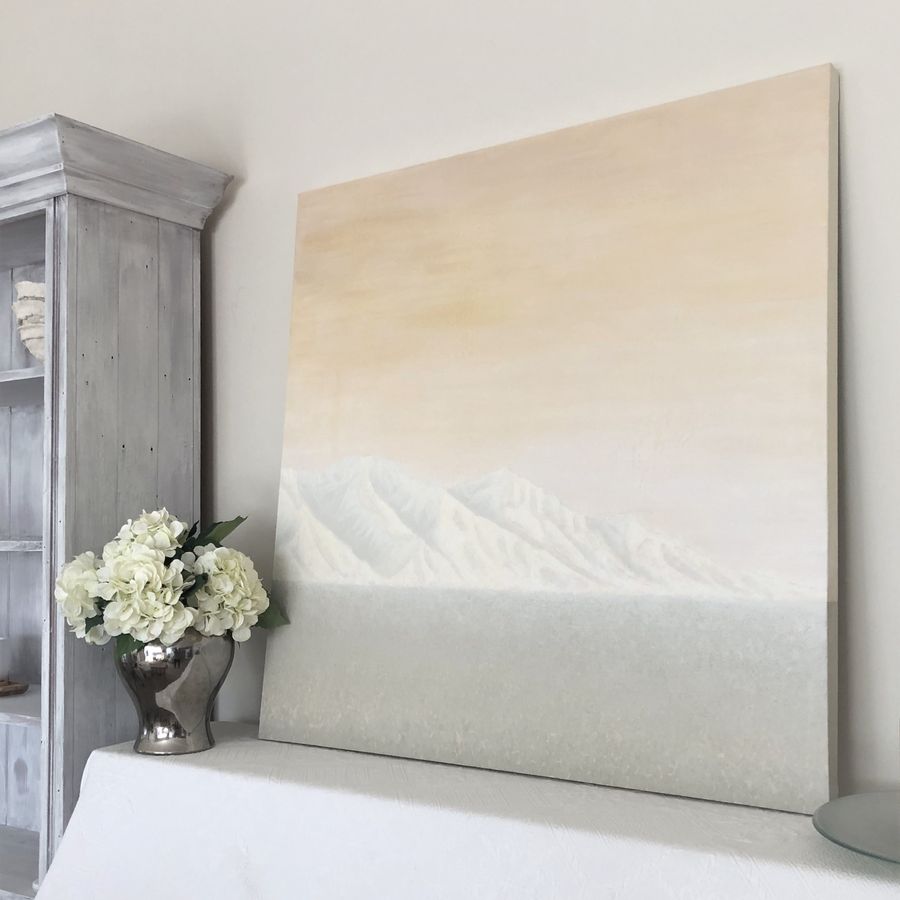
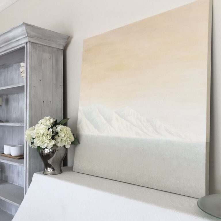
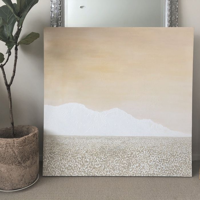
This painting was inspired by a photo I had seen on Natalie Kolter’s website My Vintage Porch. She had shared about the mountain view at her new house, and when I saw the photo of the mountains, I was instantly inspired.
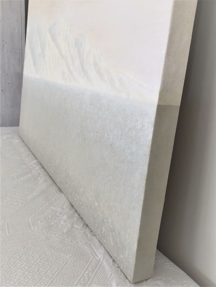
This canvas is approximately 1 x 1 metre, and the side depth is ~38 mm.
The paint brands that I used were Chromacryl (colours) and A2 (titanium white). If you’re looking to create neutral toned art, I recommend using earth tone colours, like raw sienna, yellow oxide, red oxide, raw umber etc.
The Process
This canvas was originally another painting. It wasn’t in the style or colour scheme that matched the room, so I opted to paint over it.
I painted over the previous painting using titanium white, which is more opaque than regular zinc white. Another option would be to use gesso, which is a white acrylic primer, designed to adhere and cover the canvas before painting.
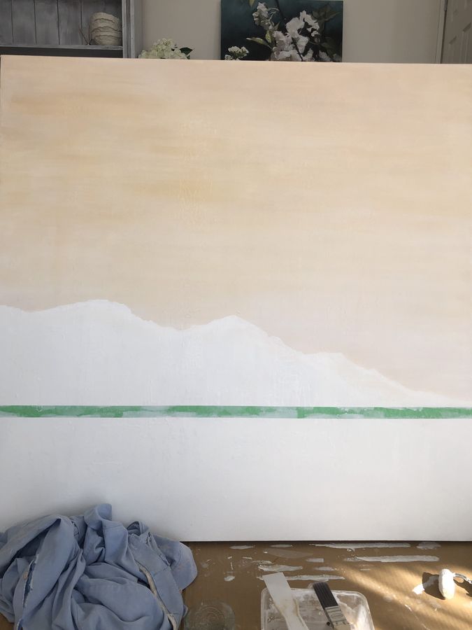
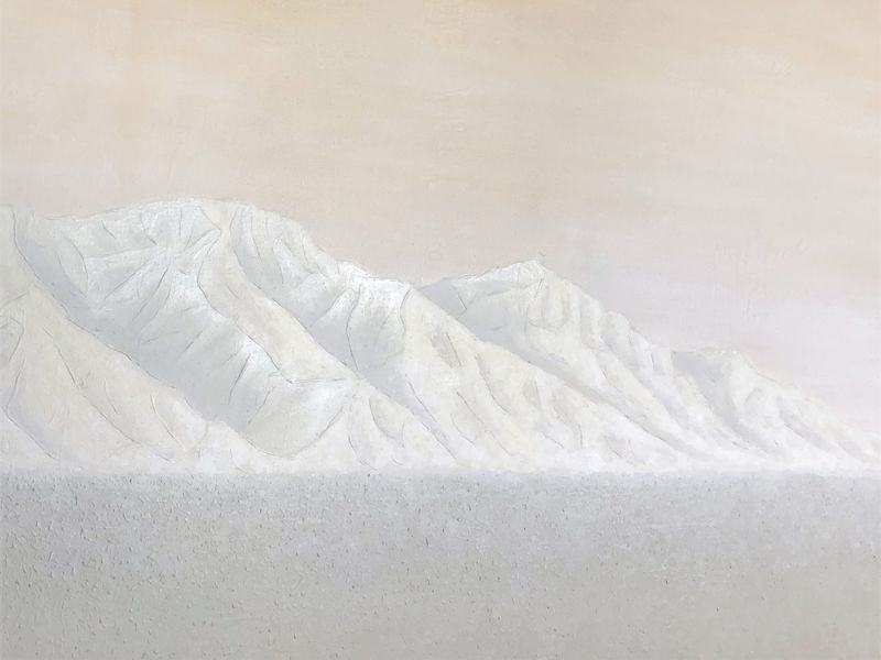
The first step was planning out the location of the foreground, mountains and sky. I had an idea, or vision in my mind, of what I wanted it to look like.
I measured out with pencil the height of the foreground, and divided it from the mountains with painters tape, then I lightly sketched the height and shape of the mountains.
The sky itself was a relatively easy process. It relies on blending the paint in horizontal strokes to achieve a seamless finish. The base colour was titanium white (which gives the colours a pastel brightness), a little raw sienna, and a little yellow oxide.
The raw sienna with titanium white creates a neutral skin-like hue, but was slightly too pink, so the yellow oxide was added to create a softer gold hue.
The last step was to use a whitewash technique to lighten the sky. This was simply regular white acrylic paint diluted with water, and applied using the same horizontal blending technique. This is one way of changing the lightness of your colours, if you find it is too saturated or bold for your liking.
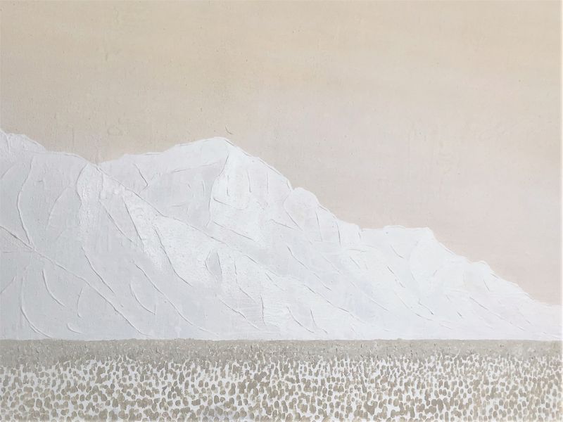
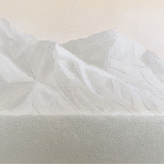
The Foreground
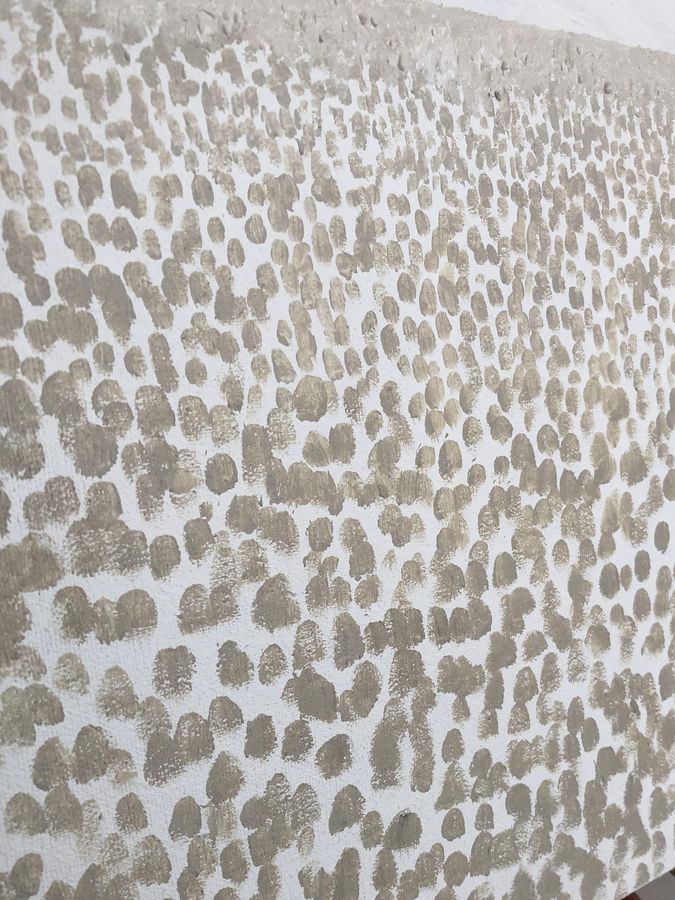
This was largely experimental and I went through various styles and layers to create an abstract effect.
There were various hues of sage green that I used for the foreground. The foundational colours were yellow (warm or cool), a little warm blue (to create a green tone), a tiny amount of black (to create a grey neutral tone), a minuscule amount of cool red, and varying amounts of raw sienna.
I then lightened it by adding lots of titanium white. I opted to use titanium white rather than regular zinc white, as it creates more of a pastel colour.
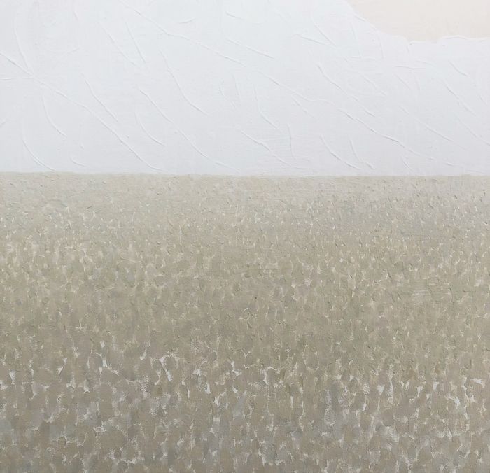
The texture was created by adding thick blobs of paint to the canvas. I used the paint, as it was, to create this effect, but another method of thickening your paint is to use an acrylic gel.
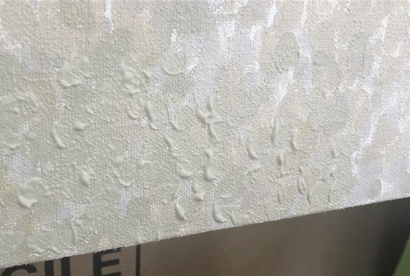
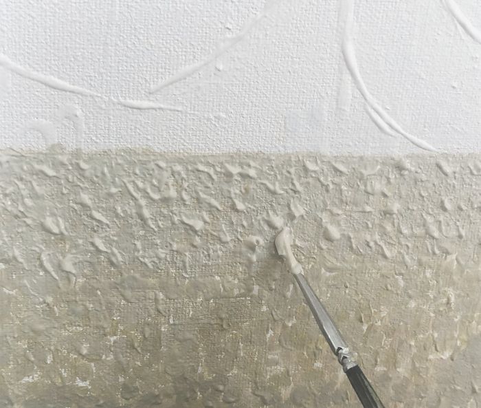
Lastly, I went over the thick peaks of the paint, lightly brushing over them with a little titanium white to create soft highlights. The key is run your brush as flat lengthwise across the peaks, so it hits the peaks but not the base layer underneath.
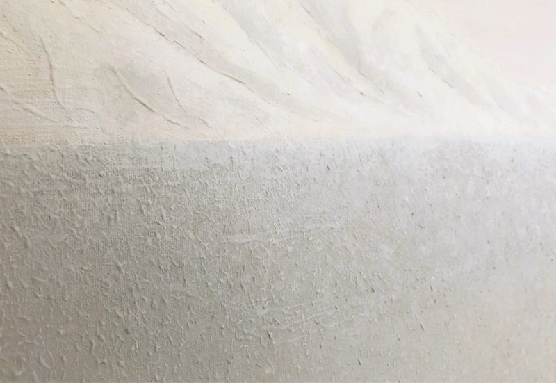
While hard to capture on camera, this photo does give a good impression of the soft tonal nature of this painting.
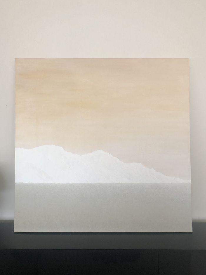
The Mountains
I used a similar technique of using thick applications of paint to create depth and texture along the ridgelines of the mountains. Again, acrylic gel could be used to thicken your paint for this application.
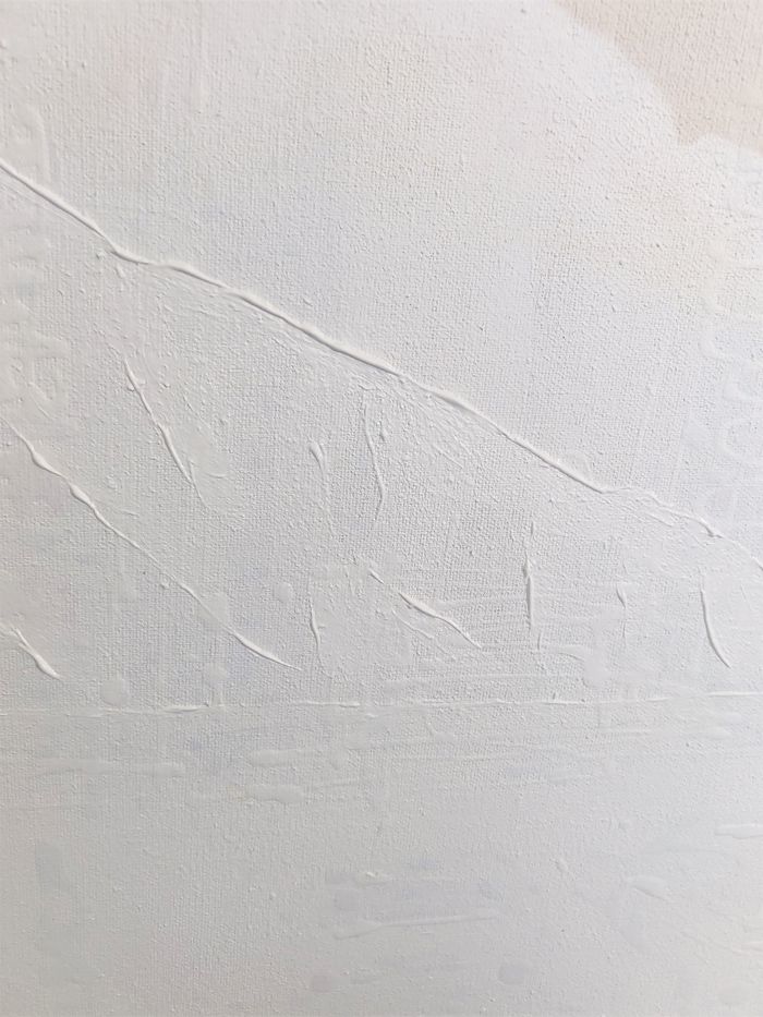
The shadows of the mountains were created using a beige colour. I used a little raw sienna, little yellow oxide, tiny amount of black, and titanium white. This base tone can then be diluted with water on your brush to fill in the other parts of the mountain.
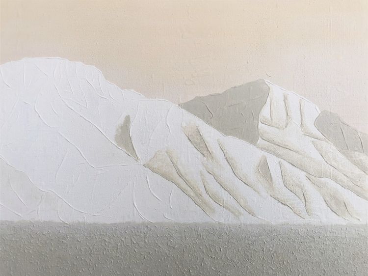
The highlights of the mountains were lightened using titanium white.
I did create another layer of depth to the mountains by doing a light wash of an earth tone yellow to warm up the colour a little. This was created using warm yellow, tiny amount of black, raw sienna, and lots of titanium white.
Again, this process was largely experimental and went through many variations before I was happy with the end result.
Painting the side edges of the canvas creates a more ‘finished’ look to the artwork.
Final Thoughts
While hard to capture on camera, these photos do convey the soft, restful nature of this painting. Because of its large size, it has a noticeably calming effect on the room.
Using large scale art pieces, rather than, say, painting an entire feature wall, can be another way to change the style and mood of the room, relatively simply.