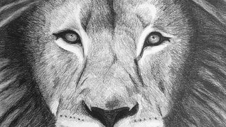
When you look into the eyes of a lion, what do you see?
I usually see one of two things, intense majesty, or fear.
It depends on the lion.
~
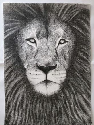
When I drew this lion, it was completed in the space of a 24-hour period. It was definitely an inspired act.
After completion, I kept coming back to it, over and over, and just staring at it.
I couldn’t believe it almost.
And I would cry, something deep moved me inside as I looked into his face, his eyes. Something about the way he looked at me.
In his eyes I saw kindness, but I also saw intense majesty.
It was a wonder…
~
Here are the steps I took to draw this lion.
The Eyes
I generally always start with the eyes, either one or both. I will draw them as detailed as possible, as I find it gives an immediate sense of grounding and focus to the sketch, with everything else following along after that.
The eyes always make the image.
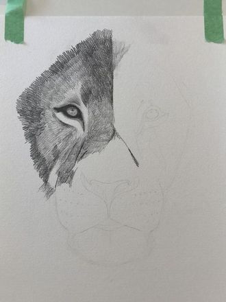
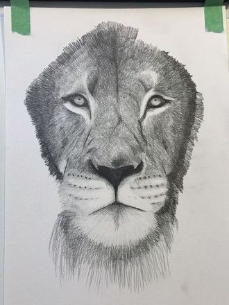
In general, I start with lighter pencil strokes, then use more pressure to make the sketch darker in places. I will always refer back to the reference image on my screen as I continue, carefully observing darker and lighter areas, areas where I want no pencil marks, and the direction of the hair strokes on the face.
This does take practice to apply the right amount of pressure, and how to create illusions of texture and patterns on the face using pencil strokes. In general, I also rarely use the smudging technique, as I find it lessens the ability to create fine acute detail, especially in parts you want high detail, such as the eyes and face.
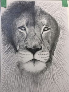
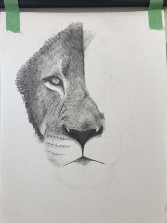
In the above image, I used too much pressure on the lion’s mane at the top left. This meant I would lose the illusion of depth and motion in his mane, so my only option was to use an eraser to remove some of the pencil marks and create ‘light’ back into his mane. This is less than ideal, but using an eraser is super helpful if you do make mistakes.
The next step was creating volume, lightness and depth in his mane. I used the reference image to get a general idea of where and how his mane flows, and where the light hits and where it doesn’t.
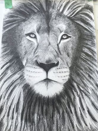
With the mane, I used very light smudging over some parts to create some softness over the hair as it flows down. The main texture, however, was created using light and heavy pencil strokes. This can also be achieved using different grades of graphite pencil, such as 6B for darker areas, HB for more defined lighter strokes, or 2H for very light strokes or shading.
The Final Sketch